Building my new website: An adventurer's log, part 2
This is a post in a series about building my new website, check out the previous post in this series.
anchorDay 3:
Feeling ambitious, I write a Svelte store that allows me to manage the minimized/maximized state of all the windows. Unfortunately, I notice that the order in which the window ‘registration’ occurs is random, and I’d like it to reflect the order on the page, so I spend some time trying to coax it into order while cursing my existence. I end up with a workable solution that doesn’t take too long, as I’m personally ok if the window list at the bottom of the page comes in after JavaScript renders as it’s mainly for ‘flavor’. If it was a part of the main content, I probably wouldn’t accept this tradeoff.
Deciding that I’m done with JavaScript for the day, I move on to some of the design aspects. I first establish the kind of button style I want for the UI buttons, which requires attempting to rewrite the pixel-borders mixin. I successfully refactor the mixin to use relative units, so that it scales nicely with the rest of my UI, but I cannot get it to take my CSS variables as a color input. This is because the mixin uses SVGs within a CSS url attribute, and these are treated as as external documents. I experiment with using mask borders instead of border images, but the browser support is pretty bad. Defeated, I accept that my design system will no longer be ‘perfect’, and accept that I have to pass in a hex code for my borders.
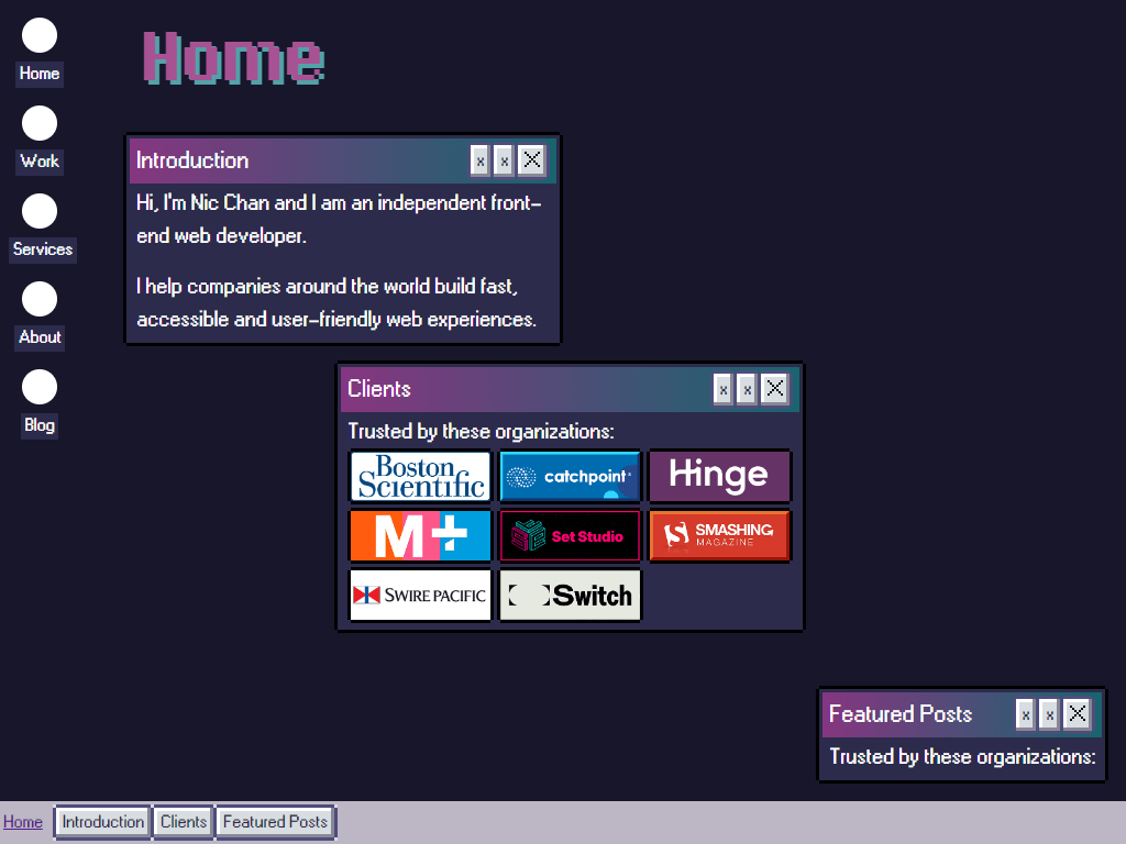
I throw together a list of client logos and hope no one gets too mad at me for ruining their brand. I’m going for the crunchy 88*31 blinkie look, though I decide to increase the size for legibility. Think geocities, but purple.
I hastily scribble together a close icon (a little ‘x’) to see what it looks like in context. I fall down a bit of a rabbit hole, making many different versions of the icons across different sizes and resolutions. My normal SVG workflow is to run them through SVGOMG, but this has a disastrous effect on the pixel art style. The default export from the spriting program I’m using draws individual rect elements for every pixel. As you can imagine, this doesn’t generate the smallest file size, but preserves the pixel art as one would expect. SVGOMG converts the rects within the svgs into a path, which smooths the whole thing out. While this behavior is normally desirable, this is exactly what I don’t want for this project.
Through my experimentation, I discover the image-rendering: pixelated property does exactly what I want it to as well! I now have a suitable method for rendering both SVG icons and raster images! I can pick and choose based on the file size, since the SVG exports won’t be as tiny as they normally are. Chuffed with my progress, I leave it here for today.
anchorDay 4:
Day 3 and day 4 happen with a huge gap between them. This is because I feel the need to flesh out the illustration work a lot more before moving forward. I’ve been working on a client project where illustrations were involved, and it was difficult to progress with the final design work until the illustration style was fully locked in.
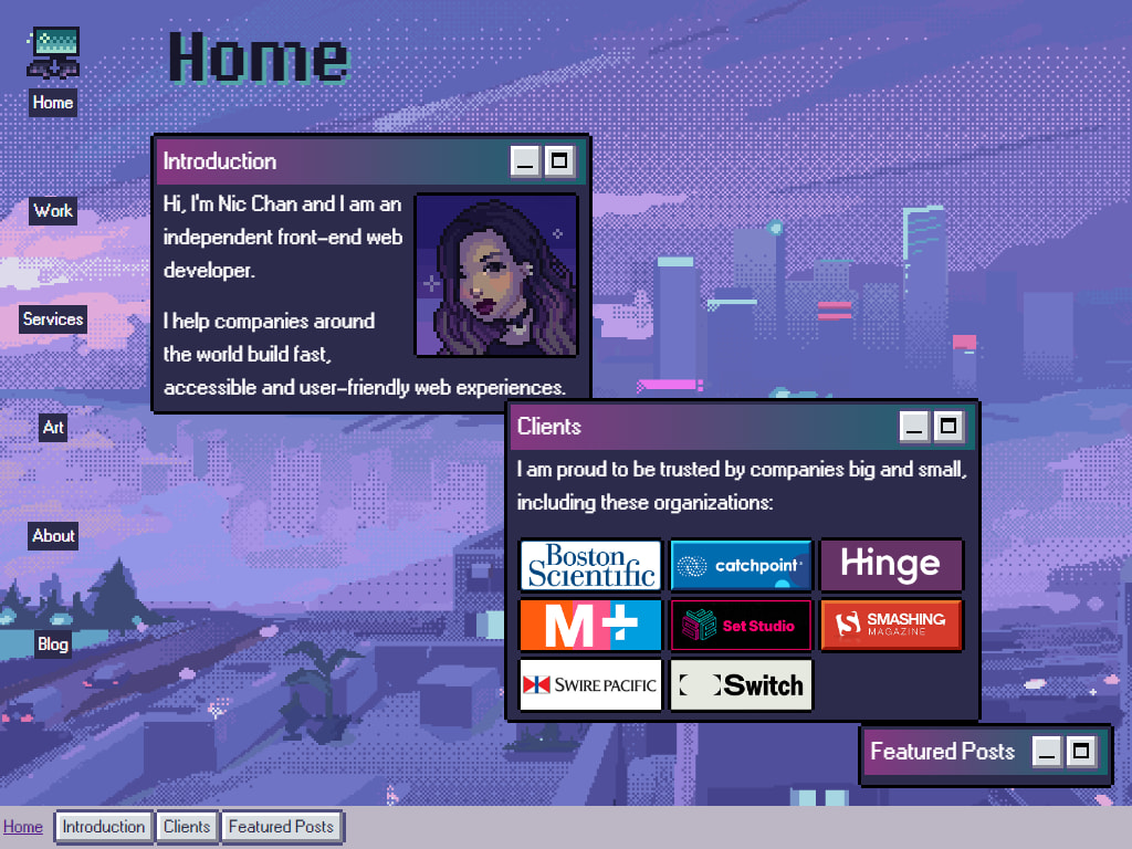
In my case, this meant working on at least one of the ‘desktop icons’ as well as the background. This may lead you to think I spent a whole bunch of time painstakingly crafting the illustrations, but actually I just procrastinated until I felt too much guilt and finally opened up Aseprite, the new pixel art editor I bought just to make these illustrations. Sometimes, I find myself needing to invest in something that will help me get stuff done as a motivational tool.
I’m not entirely happy with either the background illustration or the icon, but now that I have a sense of direction, it helps me out quite a bit. I adjust some colors to make sure they meet contrast requirements, something that was hard to do without having a background in place. Right now, I’m dumping all my images in the repository instead of Cloudinary, because I can’t make any decisions. Much to my chagrin and embarrassment, I’m up to 8 versions of the close button alone, and 5 versions of the background. I hate to say it, but I'm up there with the most indecisive of clients.
The particularly observant of you may note that although I have 8 versions of the close button, but don't have any close buttons at all in the screenshot above. Fear not, they will return again, on another page! I think it doesn't make sense to have the windows be closeable on the homepage, so yeah.
I did a lot of work developing the window component and how to make it usable for various different contexts, like what happens if there’s just one content window vs. many, how they stack on top of each other and etc. This didn’t result in a lot of ‘visible’ changes, but it helped me feel more confident in the overall direction of the project. If I know the fundamentals work, I hopefully won’t reach a scenario where the entire UI idea falls apart. Hopefully.
I spent a long time playing around with the new View Transition API to animate how the windows would maximize and minimize. For the most part, it looks really slick when it comes to moving things around, even with the defaults. The one animation I don’t like is the maximizing window option. I was expecting the text to reflow like how the browser does it, but since learning that the API basically transitions static images, it meant the text scaled up statically, then janked back into place, and there would be no way around this.. I opted for the default cross-fade animation for maximizing instead. I know there are ways to make this work with animation libraries, but I didn't want that kind of overhead.
Writing that last paragraph sent into a small existential crisis as I contemplated if Svelte was the right technology to use. I like Svelte and enjoy building with it, but I wonder if I would have been better served by making the Window svelte component a web component. Putting your money where your mouth is, as one might say. The premise seems simple, but I don't feel too optimistic, as there is quite a bit of state that needs to be managed externally (ie. the footer windows), and I do need to reach out of the component to calculate some sizing and positioning attributes. I tell myself it was the right decision to build it as a Svelte component, and cry myself to sleep.