Building my new website: An adventurer's log, part 3
This is a post in a series about building my new website, check out the previous post in this series.
Author's note: I'm abandoning the day format as I realized I tend to work on things during the downtime of other moments, so the 'days' became arbitrary units of when I felt enough stuff was accomplished to write about, thus defeating the purpose entirely!
It's been quite a while! Towards the end of 2023, I got sucked into project work. I felt a bit mixed on this, I was grateful to not be struggling at a time when the industry faced mass layoffs, but at the same time, it really pulled me away from all the 'extracurricular' work I like to do. Nevertheless, 4 months later, I'm finally out of the woods and back on track.
anchorHurrah, it lives
At some point, I managed to get a deploy going on Netlify so I could be sure that the whole thing actually builds. I'm not exactly sure when this occurred, but I am very proud of my past self. I'd much rather debug a build as the process goes along, plus it gives me something to show people.
anchorCSS Logical Properties
I suddenly remember that I want to switch over to CSS Logical Properties. I know I'm a little behind the curve on this one. I do often work on projects that involve Chinese, a language that can also be displayed vertically, so I want to try learn this ASAP. It's a pretty easy conversion, but I do get stuck on if I want to set widths and heights using logical properties. I'm not entirely sure I want to account for re-orienting this very complex window layout, so I just focus on the text properties for now, to treat this as a learning experience.
anchorTestimonials
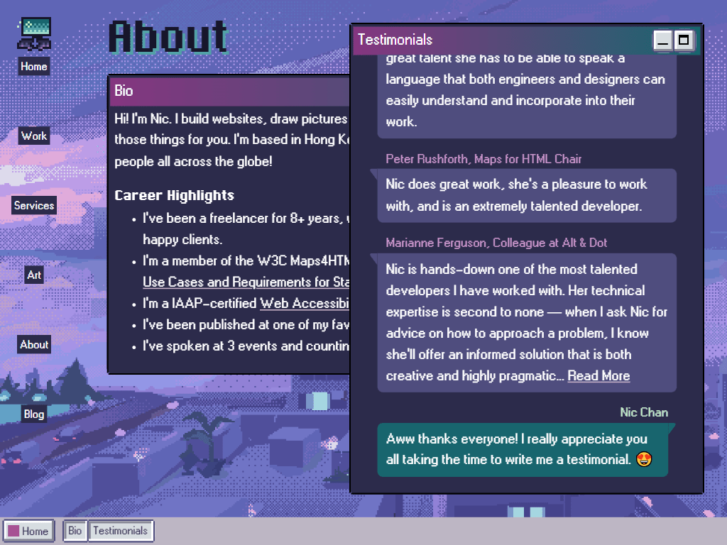
I build out the testimonials section in the style of a chat interface. After spending so long tinkering on little things, it's nice to do some CSS work where the little things fall into place! Note to self, go ask more recent clients for a testimonial.
anchorBlog post styles
I'm at a point where I'm starting to work on the styles for my long-form content. I spend way, way more time on this than I want to, but I am really picky about these things. It's all little things like tweaking the heading colors, the list styles, things like that. I love a good personal site where the text content just feels super polished and thought out.
I somehow find myself spending a significant amount of time working on the windows, again. There are slightly different behaviors for the windows based on things like its state (whether it's minimized, maximized, or in its default mode), the size of the viewport and whether or not there are other windows present on the screen. Plus, each window accepts a wide variety of positioning and sizing props, which still need to work responsively. Getting all those combinations right is gonna take up even more time than I thought. I make a mental note to check in with some accessibility friends about the expected focus management behavior.
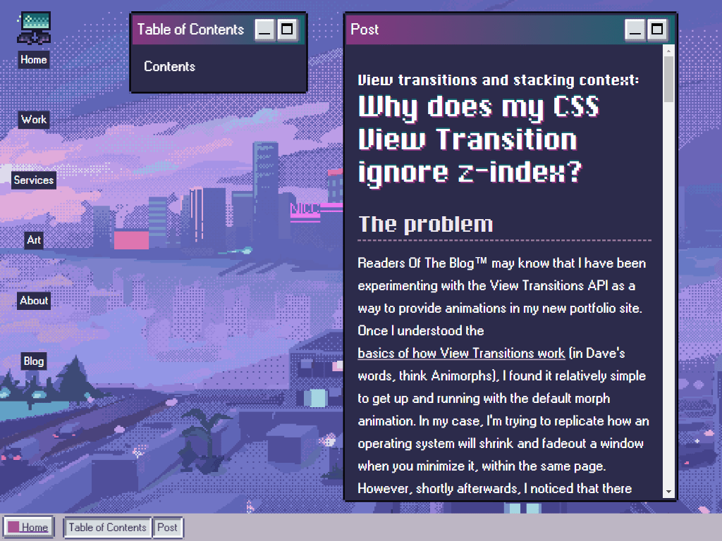
I really want to make a table of contents. I know I'm VERY rambly and therefore it's nice to have a link to all the headings somewhere, but I realize that I need to build yet another window configuration if I'm to make it work. This variation on the window is positioned absolutely on middling screen size viewports, but centered on super large viewports. I get really sad that I can't use CSS variables in media queries, this would make this an extremely elegant way to handle this, but I end up just going with a number that works for now.
Shortly after finalizing this approach, I make a breakthrough on a grid-based approach that I had experimented with and abandoned prior. I was having trouble making sure the contents of my windows would scroll within their containers, but I realized I just had to keep it simple and remove the absolute positioning from the grid children. D'oh! I adjust the blog post and about pages to utilize this new layout, which looks nearly identical but it pleases me to have a more elegant solution that looks better on more screen sizes.
anchorRefactoring the SCSS Mixins
Here, I had another breakthrough and realized I could simplify my pixel borders. I was using this pixel borders SCSS mixin, and my major gripe with it was that it didn't work with CSS properties, due to being written in the SCSS age. The mixin also supported different levels of roundedness, and I had decided pretty early that I on that I only want a single 'pixel' chunk cut out of each corner. This means I could replace all of this:
@function str-replace($string, $search, $replace: "") {
  $index: str-index($string, $search);

  @if $index {
    @return str-slice($string, 1, $index - 1) + $replace +
      str-replace(
        str-slice($string, $index + str-length($search)),
        $search,
        $replace
      );
  }

  @return $string;
}

@mixin pixel-borders(
  $color,
  $border-radius: calc(var(--border-thickness) * 3 + 1px)
) {
  $escapedColor: str-replace($color + "", "#", "%23");

  border-style: solid;
  border-width: var(--border-thickness);
  border-color: var(--border-color);
  border-radius: $border-radius;

  border-image-slice: 2;
  border-image-width: 1;
  border-image-outset: 0;
  border-image-source: url("data:image/svg+xml,<svg xmlns='http://www.w3.org/2000/svg' width='6' height='6'><path d='M0 2h2v2H0zM2 0h2v2H2zM4 2h2v2H4zM2 4h2v2H2z' fill='#{$escapedColor}' /></svg>");
}
With this:
@mixin pixel-borders() {
  border: var(--border-thickness) solid var(--border-color);
  mask: conic-gradient(
      at var(--border-thickness) var(--border-thickness),
      #000 270deg,
      #0000 0
    )
    0 0 / calc(100% - var(--border-thickness))
    calc(100% - var(--border-thickness));
}
I took much inspiration from this great article by Temani Afif. Thanks Temani, you really saved me on this one!
At this point, I contemplate moving off of SCSS mixins briefly. I am not against utility classes and have a couple myself, but I'm using mixins primarily for the pixel borders and focus outlines, and I may want them within blog post content. I don't particularly fancy applying a focus-outline class to every single link in my text content, either through using a parser or manually. As a result, I conclude that mixins are helping me enough to survive this brutal round of code culling.
After doing a bit of cleanup, I come to the horrifying realization that CSS masks cover the outline property, which is needed for focus outlines. I read the spec to make sure this is as intended, and confirm that it is. It doesn't feel great to me since it means a wrapper element is necessary when using masks on interactive elements to make sure you don't completely break your outlines, but I accept this as a tradeoff.
With all this tinkering, I've probably spent an entire workday on changes that are basically completely invisible outside of a couple of niche cases:
- the window arrangements don't stack unnecessarily on small desktop screens
- buttons don't have this gross blurry border when subpixel rendering is forced (basically only if you're zooming.)
It's hard not to feel a little despair here at the time to effort ratio. I take solace in the fact that during the process of sorting all this out, I did a deep dive into CSS masks/clip-paths/mask-borders, and feel confident that I could apply them on future client work, so it's not too horrible.