Building my new website: An adventurer's log, part 1
I’ve been getting the itch to redo my site for a while now. There’s nothing wrong with my current site per se, but I felt like my abilities have levelled up a bit beyond what is on display. Additionally, the thought of writing new case studies when I wasn’t going to be fully happy with the outcome proved to be a task so daunting that I never got around to writing them. Whoops. Finally, a lot of the copy and design aspects of my current site were created when I was a bit more aimless in my freelance career. Now that I have a stronger sense of what I’d like to focus on, it seemed like a good time to refresh both the brand and the copy.
I know I wanted to do something with a lot more fun and flair, while still remaining accessible. I know a lot of designers feel ‘constrained’ by thinking accessibility, so I wanted to build something that showed that you can still build something fun and beautiful while thinking about accessibility. I have a deep love for pixel art and retro games, and felt with the View Transitions API coming out, I could experiment with building some kind of operating system like interface for my new site.
Folks have occasionally asked me to share my work process, but I typically work on sensitive projects that I can’t share too many details on. Writing about this process as I go about it provides a rare opportunity to share a little about what I’m doing for once, so I hope you enjoy! Feel free to send me a toot on Mastodon or an email if you enjoy this series so I know whether or not I should keep writing these.
anchorNon-development work
I am not a designer, and I have limited ability to use any design software to produce designs. When I am in a position where I do have to design, I tend to come up with stuff more iteratively. I typically tend to only nail down the broader stroke stuff first like colors and type, then I refine as I go on. I looked at pixel style video games, ‘vaporwave’ UI designs and the good ol’ Windows 95 UI to in order to get a sense of overall design language.
Because I liked my current site colors, I grabbed all my primary brand colors and shoved them into this color scale generator. I tinkered with it to make 2 lighter and darker tints/shades for each primary color I had, then I plugged everything into my all-time favorite, Are My Colors Accessible to make this monster color chart that I could reference to find accessible color combinations.

I did a few font tryouts but settled on W95FA as my main font. I liked how legible it is compared to other pixel fonts, but I also knew that I probably needed to make a toggle to allow for a high-res font in case anyone struggles with reading it. After perusing Modern Font Stacks, I settled on the 'Humanist' font stack as a nice fallback font stack.
I consulted the hivemind over in the Array Discord on sites with great about/services page, since that was an area of my site I felt was particularly lacking. Special shoutout to Steven Woodson who gave me a list of references he consulted when he went through the process of rebranding recently. Having some sense of what the copy on each page looked like made it much easier to wireframe, I'm very much a fan of designing the site to fit the content you have and not the other way around. I ended up scribbling some very loose wireframes with good ol’ pen and paper.
Finally, onto the actual development!
anchorDay 1: Panic, in my office
- Decided to stream for my mentees
- I had been struggling to choose between using 11ty (what my site uses currently) and Astro (a tool I’d like to play around more with. I decide on Astro as I think this iteration of the portfolio will be a little more JS heavy and I wanted to use Svelte for the component-y bits.
- Grace showed up to watch me stream! I panicked as I soon realized that I cannot talk and problem solve at the same time. I tried to get around this by only coding the most absolute basic markup elements while discussing CSS with Grace.
- I contemplated using SCSS or not, but ultimately decided on including it, because the Dark mode toggle pattern I use 1. relies heavily on CSS Variables 2. respects the OS preference for the color scheme but allows for overriding it via a control on the website. I do NOT want to have to copy and paste the variables in two places, as I know this will only bring me pain. For this alone, I decide it’s worth it to include SCSS.
  @mixin dark-colors {
    // all my variables here
  }
  @media (prefers-color-scheme: dark) {
    :root:not([data-user-color-scheme]) {
      @include dark-colors;
    }
  }
  [data-user-color-scheme="dark"] {
    @include dark-colors;
  }
- My dear friend EJ Mason came to my rescue and helped me answer some tough questions about CSS architecture. We vent about comboboxes. Grace listens to us very patiently.
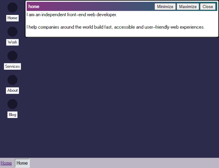
- We soon realized that with this current design, when you are on the home page there are actually 3 links that point to ‘Home’. I contemplate making the bottom left ‘Home’ button say ‘Start’, but EJ correctly points out this is a WCAG violation. For now, I make the second ‘Home’ in the bottom bar just text, and decide to solve this later.
- Copilot offers me a suggestion to generate the JS and markup for the Minimize, Maximize and Close buttons. I accept this suggestion to save myself the pain of typing it out. EJ and I realize that while the JS for the buttons is functionally correct, the HTML for the buttons is all unlabelled divs. We lament the state of AI in modern web development.
- I decide to incorporate this pixel borders SCSS mixin as it looks awesome and justifies my use of SCSS, but realize it only uses pixels instead of rems and does not take CSS variables. I don’t think the use of pixels is ultimately terrible as the borders not resizing with font sizes isn’t the end of the world, but I would like to see if I can rewrite it better for my own modern workflow later. I include it as a utility class for now with the intention of rewriting it.
anchorDay 2: Looking at the View Transitions API

- I promised all my friends banana bread today but realized I actually tossed my banana bread pan, so I need to go buy a new one. Unfortunately, the kitchen supplies store was closed so I had a few weekend hours to kill. Back to the website it is!
- I wanted to make it so that when only the screen is large enough (to account for high zoom levels), the footer and sidebar icons remain sticky, and the content of my little window panes scroll within the allocated space remaining. However, CSS Grid is NOT cooperating with me and despite setting
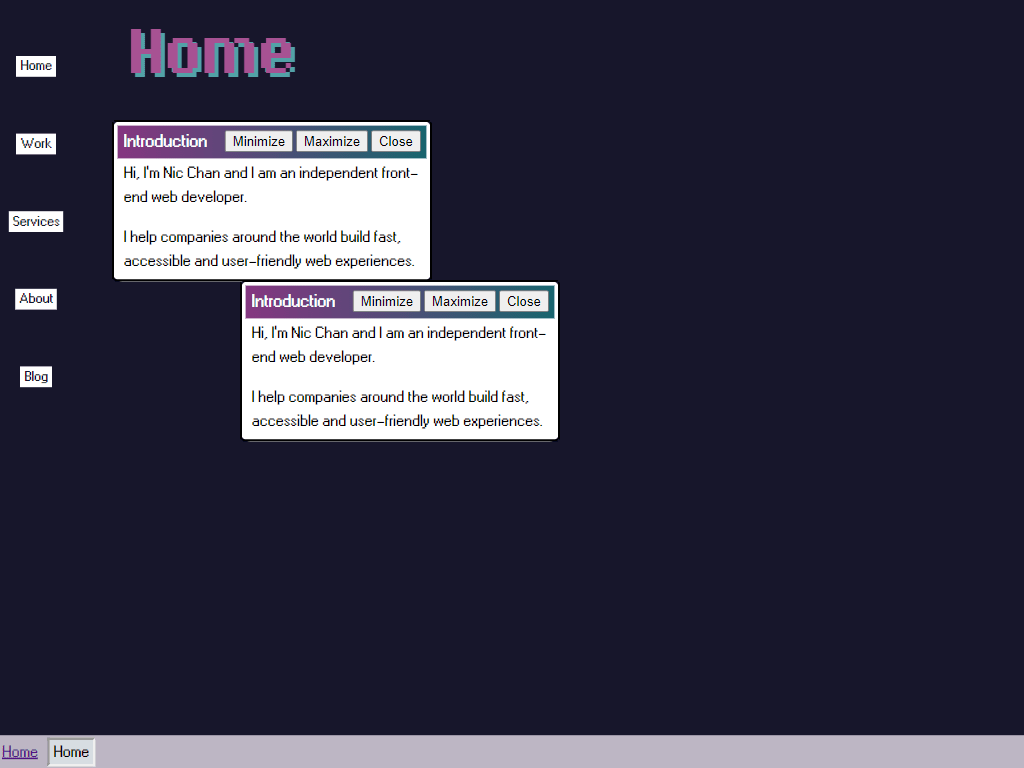
max-height: 100dvhon my grid container, the main content grid item decides to bust out of it. I spend an hour or two pouring through stack overflow until I found this answer, which informed me that grid items have an implicitmin-height: autoon it. I setmin-height: 0on the main window pane area and the layout snapped into place as it should. Who knew! - I contemplated stuffing each page’s content into one giant window vs. creating little windows, and even contemplated the dreaded possibility of having different windows for small screens and large screens. Decided that multiple little windows make for good sectioning elements and that it would be fun to fill the horizontal space on larger screens. I made a note to write the rest of my homepage copy with urgency.
- Came up with a little way to pass in different positioning props into the windows so I could arrange them nicely on desktop for each page. I get the window ‘maximize’ functionality working without a hitch.
- I thought the default View Transitions way of cross fade-ing the windows looked pretty cool. Tried to come up with a better custom transition that scales the window size, but ultimately returned to the cross fade for now as I noticed that the text size scales up with the animation in a weird way.
- I realized that I have inadvertently solved the start bar ‘Home’ design problem by breaking up each pages content into multiple windows as I can just have the list of windows titles, but this creates a lot of extra work if I want to support ‘minimizing’ a window. I wanted this to be possible as the original plan was to create some absolutely gorgeous pixel artwork for the background that hopefully people wanted to look at. Implementing this as planned meant creating some kind of global window store object that tracks the state of each window. I also agonized over ‘Close’ button, which I was going to treat as a ‘back button’, where closing the window would return to either the Home page or the parent page (ie. all blog posts if you are on a blog page, etc.) I then wondered if that’s going to be confusing UX, and realized I had no idea what to do with the ‘Close’ buttons on the homepage. Finally, in classic anxious form, I contemplated omitting this section completely as it was likely to be too confusing to read, but settled keeping it as sometimes Web Sites Are Pain and this log should reflect that.
- Wanted to create a live link somewhere to gather some inital feedback, but realized I broke the default Astro blog template somewhere along the way.
- I decide all of this is just way too much for a Saturday morning and notice that the kitchen goods supplies store is now open, time to make banana bread!